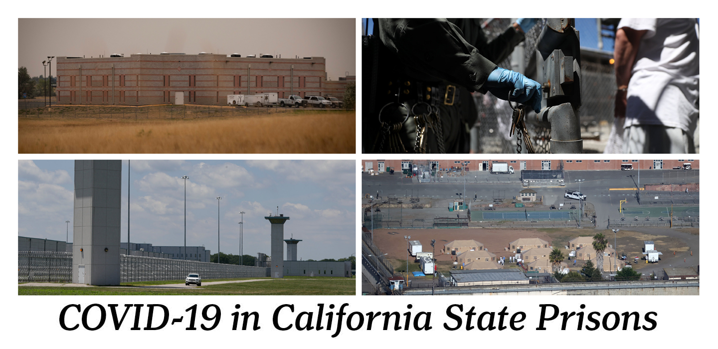
The data presented through our maps begins to tell the big picture story of COVID-19 Pandemic in California state prisons: some have faced unprecedented infections rates nearing 90% of inmates, prisons in more populous counties have been more affected, and the overrepresentation of people of color–particularly Black and Hispanic people–has likely meant a greater disease burden and mortality rate for inmates of color. Some of these conclusions cannot be confirmed by official sources due to the California Department of Corrections and Rehabilitation’s lack of data transparency.
Beyond this big picture story, however, lie the stories of inmates and their loved ones on the outside. Each number, data point, or dot on a map represents the complex lived experiences of people. Because of the distance created by the infectious, ongoing nature of the pandemic and the segregatory violence of mass incarceration, our project can only view the biggest trends of prison life during a pandemic. We close by sharing the above video to both elevate stories of individuals most affected and as a reminder of the shared humanity of us all.